There’s really nothing more important when it comes to marketing than a logo. That logo will appear on everything you put out there for public consumption; print, web sites, social media, web ads etc. the artwork may change and adapt from year to year but the logo must persevere for years if you want to build a brand.
I recently discussed logo design with a client and it inspired me to do an article about what I feel a logo should do and my philosophy on logo design. He basically asked me why most logos I do are simpler affairs? There are designers out there that do these very big and intricate logos that have lots of details in them. Some are big blooms of creatures, figures, monsters etc. Others have all elements in them such as lighting, weapons, body parts, etc. Those are great! They’re pieces of artwork all on their own without the poster art to go with it. So I see why a lot of events like to use them. However, I’m not a fan.
Now before you demand I relinquish my graphic designer club membership card, just hear me out! Let’s talk about movies for a moment. Throughout cinematic history there has been precious few logos out there that have ever been more than a cool font with colors and maybe some texture. Why do you think that is? Why don’t films have Big logos with lots of stuff going on and characters attached to them? Why are the most iconic movie logos in history little more than solid white text on a solid background?
Its pretty simple really, logos need to be memorable, easy to read and unique. When you think of logos for the biggest brands on the planet they are all easy to read, simple and distinctive. If you google any logo design tips you’ll quickly find that they all read about the same. All of them push keeping your logo simple. You need to design it so it looks good in a single color on a white or black background. Why? So it can be versatile and reproducible on a variety of formats and products such as shirts, mugs, hats, etc.
But alas, the problem with the design tips you’ll find on the internet is they’re all written from the perspective of major mainstream branding. Not niche haunted attractions and events branding. So how are haunts different?
Obviously a haunted house is not FedEx or Google. A haunt isn’t selling a variety of services or a physical product. They’re selling a feeling, being scared! So the logo needs to convey that but still be simple, easy to read, and unique. That’s why movie posters are often good examples for a haunted attraction or event.
Movie posters, especially horror, have to sell you on fear and there are some good examples out there as well as lots of bad ones. Let’s take a look at a classic first, A Nightmare on Elm Street.
![]()
The 1980’s had a lot of great iconic logos for movies, far more than today. A Nightmare on Elm Street really tells you all you need to know about it just from this logo, its going to be a scary movie! Logos for movies like ‘Back to the Future’ are iconic because they offer simple visual cues that tell you something about the movie. Just look at the way the arrow gives the logo a sense of motion!
![]()
The logo for ‘Back to the Future’ is very simple and would look just fine in black and white while still being identifiable as the movie logo. Same goes for a Nightmare on Elm Street. These are logos that are identifiable in any color.
Lets take a look some recent examples beginning with The Blair Witch. The 1999 logo for the original film used very simple white text with the iconic stick man image that quickly became iconic from the film. The 2016 reboot of the film series wisely didn’t stray far from the concept. They new film uses a modified stick man with basic white text over a dark background.
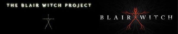
1999 Logo on Left 2016 Logo on Right
The summer of 2016 saw the huge success of the Netflix series ‘The Stranger Things’. A series that combined 1980’s Spielberg movies with Stephen King a unique new story that felt like a lost 1980’s horror flick! IF you haven’t seen it I highly recommend it. But lets take a look at that simple logo:
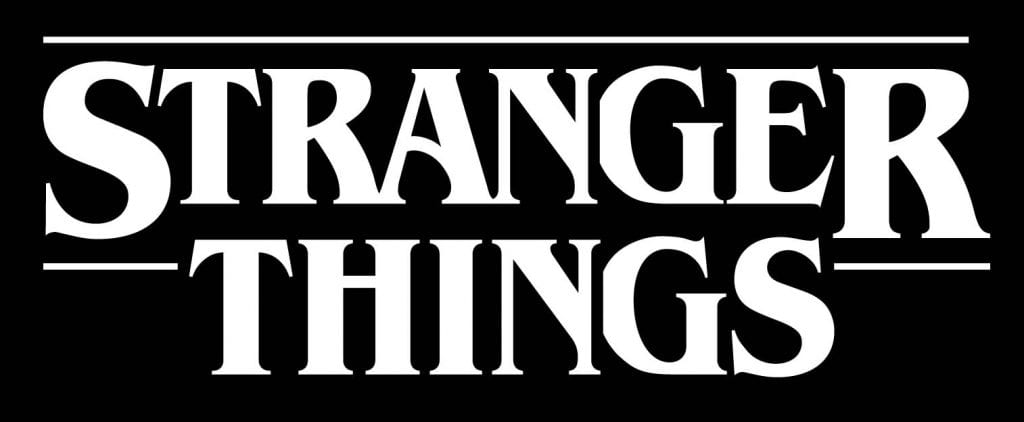
Now if you grew up in the 1980’s and read Stephen King stories than you should immediately feel there’s something familiar about this logo! The font used was a lot in the 80’s most notably on Stephen King’s novels usually as the title font. It also found its way on lots of children’s books, magazines and ads. Check out the history of this font at Collider. Its very simple and looks very clean and memorable. For a throwback series like Stranger Things its perfect.
That’s all fine and good but how does this philosophy translate to Haunted Houses? Let’s break it down!
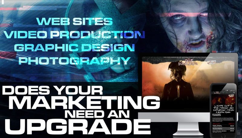
1: Keep it simple: Why? Because your logo ideally should become your brand. It should be a constant from year to year even if the poster art changes. Look at arguably the most successful haunted attraction in the USA, Halloween Horror Nights at Universal Hollywood. Their logo is very simple Trajan font with no embellishment. And its been that way for a very long time. A great example from my own work is The Dent Schoolhouse in Cincinnati Ohio. I designed a simple and memorable logo for them all the way back in 2006 and it’s been used ever since. Which leads me to my next point…
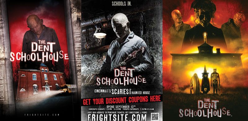
2: Make it your Brand: The Dent Schoolhouse made their logo their brand. Its simple and clean. it’s been used on shirts, hats, mugs, posters, flyers, billboards, you name it! Every year I create a new poster for Dent Schoolhouse but the logo is always right there front and center. It’s become that memorable logo that people always associate with the event no matter how crazy the poster art gets!
3: Make it versatile! The logo should be something that can be reproduced on just about anything at any size and still be full readable. The biggest issue I see with giant graphic logos like the one at the top of this article they often look unreadable and messy when they’re shrunk down. So the logo can easily be missed in a small web or print ad. Even on a big billboard you could miss it as your whizzing by at 70 mph! So make that logo easy to read at any size!!
4: make it representative of you event! Haunts often change themes from year to year but the logo should always be something that represents your haunt well. Meaning it feels like its organically part of your event even if your themes change from year to year. You shouldn’t be changing the look of your logo dramatically year to year because you changed your theme. that causes confusion in your branding and if you’re goal is to create a fan base for your haunt then you don’t want to do this!!
5: Make it unique! This one probably seems like a no-brainer but it still needs to be said. The logos that stick around are memorable. There’s something unique about them that makes them easily identifiable. Basically this means picking a simple, clean look that is unlike anything else in your market. More importantly don’t fall in love with a logo from somewhere else and copy that. If your goal is to have your haunted event have a long lasting life then your logo should be part of that plan!
Since posting this article I received a couple great suggestions from Haunt Industry legend Leonard Pickel that I had not thought of that fit perfectly in the “Make it unique” category! The first: Don’t use the words “Terror”, “Nightmare” or the numbers 13 or 31. These are definitely words that are highly overused in this industry. Let’s be more creative people! You’re not the first person to think of calling your company Ten Thirty One. We’ve all thought of that at one point or another and throught we were brilliant for thinking of it until you did a google search and found out that every other haunter thought of that too.
Leonard also suggested to not use your location in the name of your event. (IE “Horror on Main St.”) Why? What if you have to move off that street at some point? Then what?
So there you have it. My philosophy on haunted house logo design. Thanks to Leonard Pickel for his suggestions! You can find him online at hauntrepreneurs.com. So, what do you think? Am I Crazy? If so email me. Want to hire me to create a logo for you? Check out our Logo Design page and Call us today!
#GoRogue