One of the coolest projects I had the honor of working on was Rob Zombie’s Great American Nightmare. I’d always been a huge fan of Rob Zombie so it was like a dream come true to work on his Haunted House project! I came in at the very start of the project, I helped with Pitch decks, logo designs, concepts and I even came up with the name for the whole thing! Several names for the event were floating around between the management and Rob but I suggested they use Great American Nightmare (The Title of one of Rob’s Songs) and everyone was kind of like, “Yeah, that’s it!”.
So while it was awesome to be working on this project it was also a bit of a chore. There were many people involved and lots of voices that wanted to provide their input and put their stamp on the project. I started working on concepts for logos and the long process of finding the right fit.
![]()
The first concepts were more blocky and used concrete textures. These just didn’t’ have the punch that was needed.
![]()
The next round tried doing something more modern and incorporating Los Angeles, which was the first city the haunt would launch in. Again it just didn’t fit the Rob Zombie asethetic.
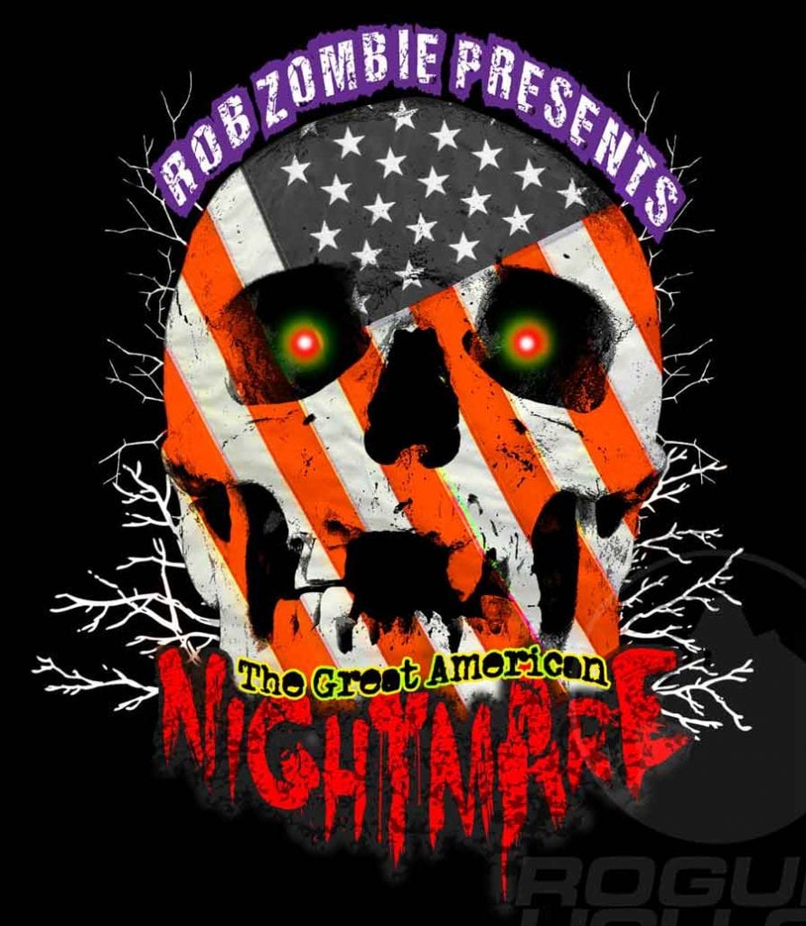
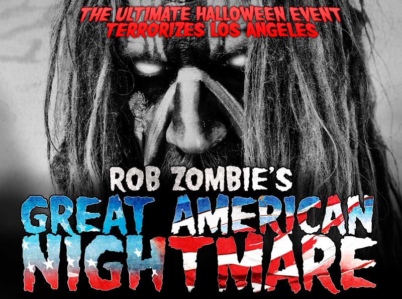
Rob Zombie himself decided to take a stab at the logo and this is what he came up with. This came pretty close to being the final logo. I did several modified versions of the logo going back and forth with Rob and the rest of the management.
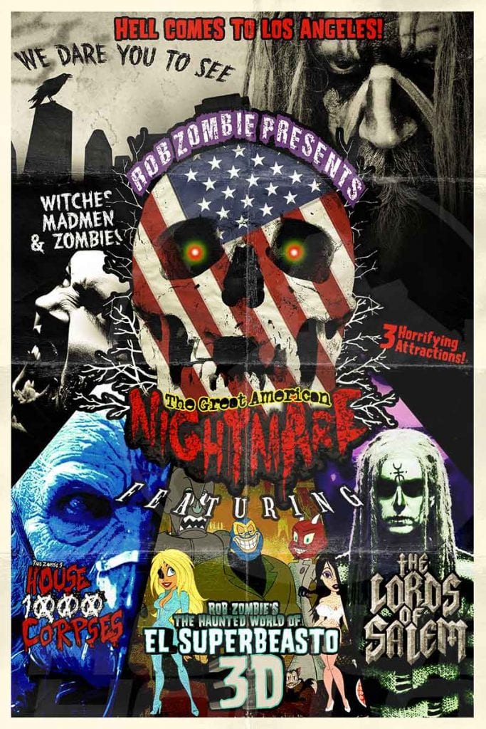
This was the first poster designed for the event with Rob’s Great American Nightmare logo. This was very close to being the logo that everyone wanted to go with but there was a growing number of marketing people concerned about how busy it was. So it was time to find some kind of Compromise.
![]()
This was the simplified logo that I came back with using a more traditional horror font that still seemed to fit the Rob Zombie look. This was going on the right track but needed more work.
![]()
This version of the logo was starting to click with everyone, and after getting some more input we finally got the the final version of the logo:
After some touch up and finishing we finally settled on a logo that everyone liked and thus the final Logo for Great American Nightmare was born!
I hope you enjoyed this little look at the work that goes into a logo design. I will be posting more stories such as this one in the future.